What’s New
A new Bubble Style option is now available for radio buttons and checkboxes in forms, surveys, and quizzes.
Key Highlights
- Bubble design provides a modern, rounded look for choice fields.
- Toggle easily between Standard and Bubble styles in the Options tab.
- Improved clarity and interactivity for end-users.
- Fully responsive across all device types.
How It Works
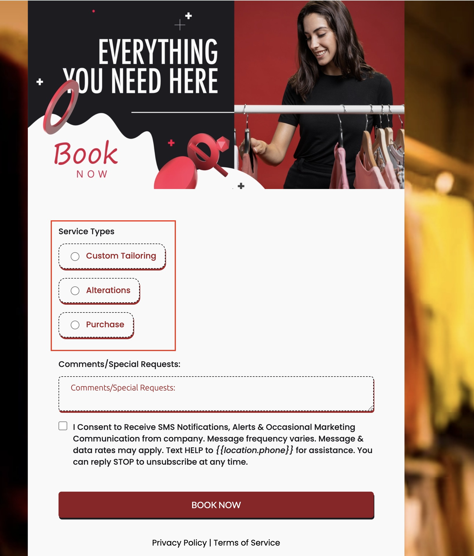
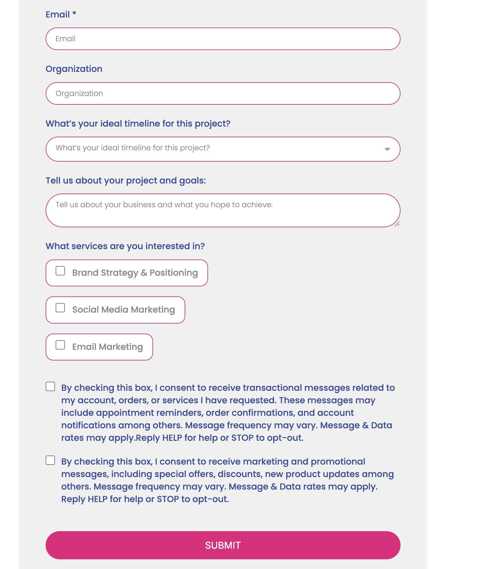
- Add a Radio or Checkbox field in your form.
- Navigate to the Options tab.
- Select either:
- Standard – the classic appearance.
- Bubble – the new rounded style.
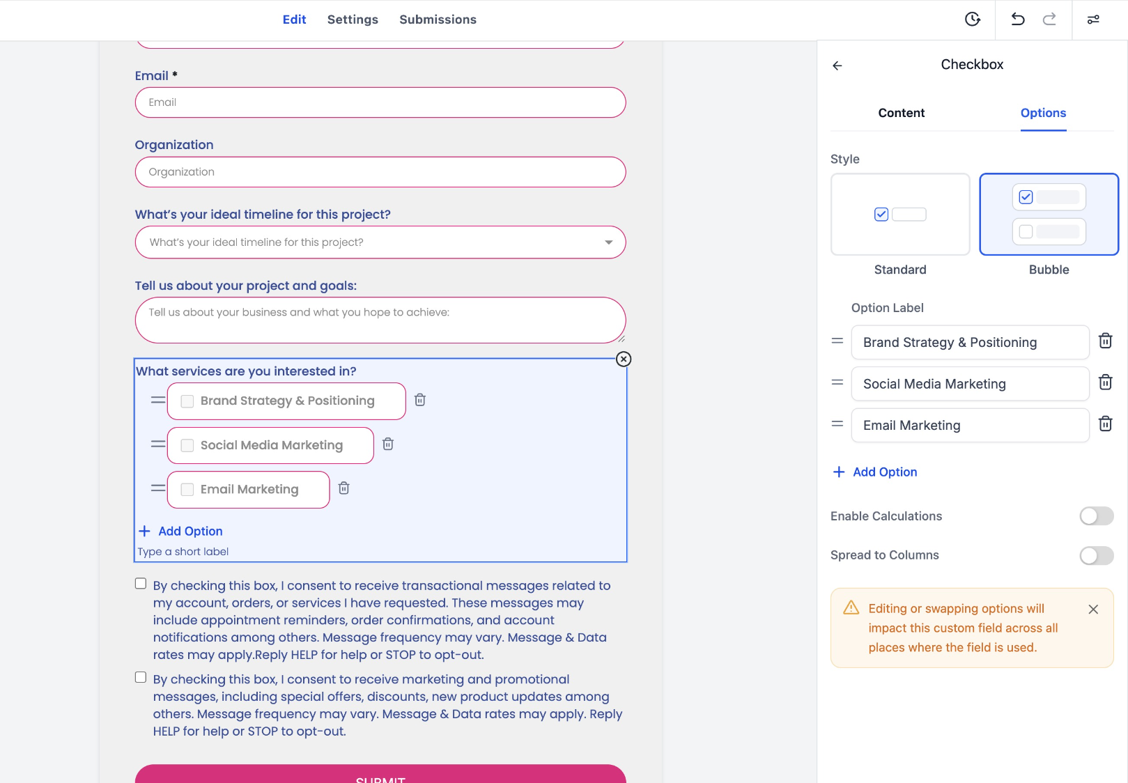
- Save and preview to see changes applied instantly.
Notes
- Bubble styling is purely visual – no impact on logic, validations, or integrations.
- All existing forms remain compatible – no migration required.
Was this article helpful?
That’s Great!
Thank you for your feedback
Sorry! We couldn't be helpful
Thank you for your feedback
Feedback sent
We appreciate your effort and will try to fix the article